People say that you shouldn’t judge a book by its cover, but everyone still does. The importance of design and aesthetics is often understated, and while the quality of the content is critical to the success and readership of a publication, so is its design.
In my four years on staff, the skill I’ve most grown is easily my design. When I first became an editor and started doing layout for our print editions of the Crossed Sabres, I tended to follow examples of how we had done past spreads to a T. Our staff uses Adobe InDesign, which can certainly be tricky to figure out. As I practiced more, I became more confident in my design skills.
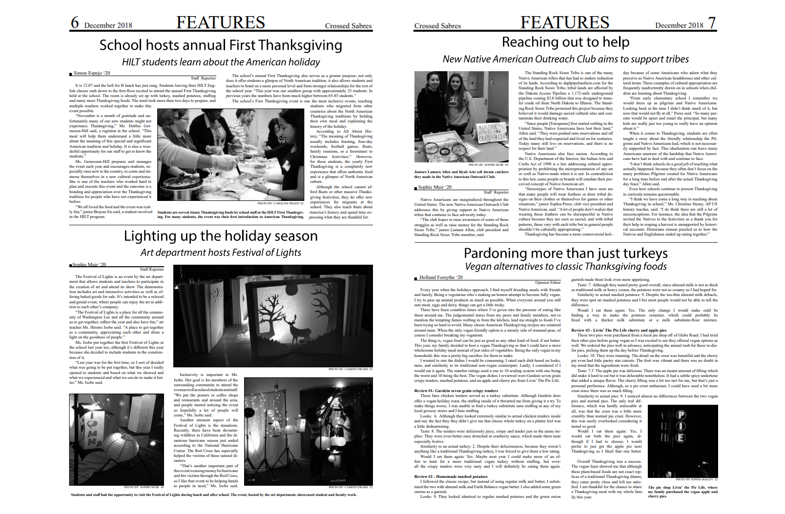
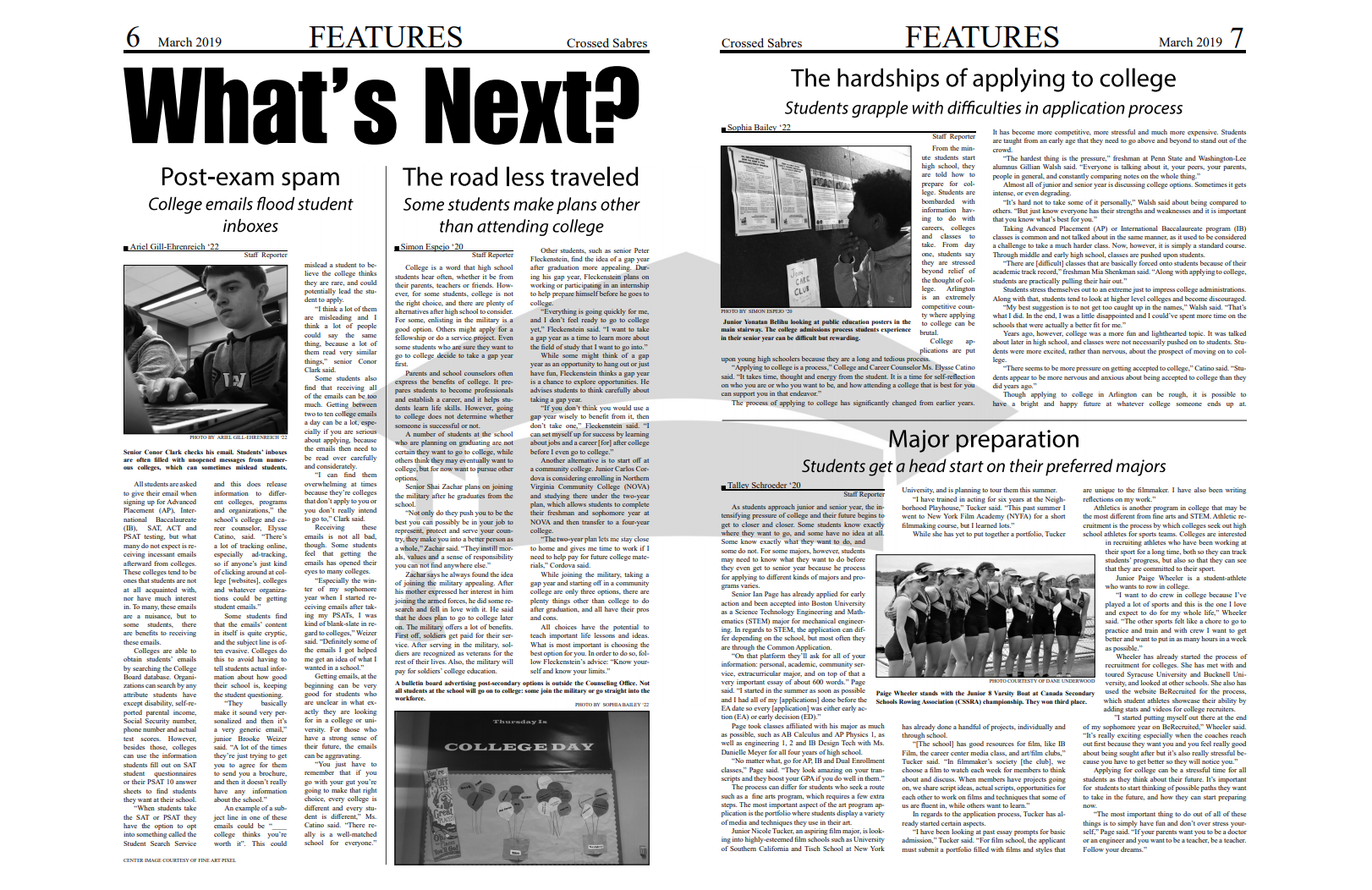
The rest of my Editorial Board and I decided this year that we wanted to redesign both our print and online publications. Our Design Editor redid our masthead for a cleaner, updated style. On February 14, we distributed the first issue of the Crossed Sabres featuring our new design. One aspect we emphasized was a stronger use of graphics. Pictured below is the sports spread of our most recent issue, for which I did the full design.

I’ve also had the opportunity to expand my design skills beyond our broadsheet style. In my sophomore year, the Crossed Sabres staff assisted our school yearbook staff in finishing pages in anticipation of one of their final deadlines. I, along with a partner from the class, designed the boys varsity soccer spread. In addition to the yearbook experience, I have been a member of my school’s literary magazine, Penman, for the last four years, for which I have done many layouts.
For more examples of my design for our print issues of the Crossed Sabres, please see the gallery below.